Hallo, Ich bin Franz! 
Ich bin interdisziplinärer Designer mit einem Masterabschluss in Design & Computation.
In meiner Arbeit verbinde ich Gestaltung, Technologie und unterschiedliche Medien, um komplexe Fragestellungen aus verschiedenen Perspektiven zu untersuchen und lösungsorientierte Ansätze zu entwickeln.
Black Box of LLMs
Black Box of LLMs
KI-gestützte Textvereinfachung transparent und überprüfbar machen
Ein Forschungs- und Designprojekt darüber, wie LLMs komplexe Dokumente vereinfachen können, ohne ihre Fehler hinter einer Black Box zu verbergen.
Wie kann ein Sprachmodell komplexe Dokumente vereinfachen, ohne dabei Bedeutungen zu verändern, Informationen auszulassen oder neue Fakten zu erfinden?
Black Box of LLM entstand im Rahmen meiner Masterarbeit in Design & Computation. Ich entwickelte ein vollständiges System für dokumentenweite Textvereinfachung in Klarer und Einfacher Sprache – von OCR und LLM-Verarbeitung bis zu Review, Evaluation und PDF-Export.
Statt das Modell als unsichtbare Black Box zu behandeln, macht die Plattform Zwischenschritte, Qualitätsmetriken und mögliche Fehler sichtbar. Dadurch wird Textvereinfachung nicht nur automatisiert, sondern überprüfbar und diskutierbar.
- [ Rolle ]
- Research · Interaction Design · ML · Development
- [ Kontext ]
- Master Thesis · M.A. Design & Computation
- [ Institution ]
- UdK Berlin × TU Berlin
- [ Jahr ]
- 2025
- [ Methoden ]
- LoRA · DPO · Human Evaluation · Readability Metrics
- [ Technologien ]
- Python · LLMs · OCR · PostgreSQL/pgvector · Web
Die Herausforderung
Vereinfachte Sprache soll Informationen zugänglicher machen. Bei LLMs entsteht dabei jedoch ein grundlegendes Problem: Ein Text kann leichter lesbar wirken und gleichzeitig unzuverlässiger werden.
Modelle können Bedingungen auslassen, Zahlen verändern, Zusammenhänge verkürzen oder plausible Informationen ergänzen, die im Ausgangsdokument nicht vorhanden waren.
Die zentrale Frage meiner Arbeit war deshalb:
Wie lässt sich KI-gestützte Textvereinfachung so gestalten, dass Zugänglichkeit und Verlässlichkeit nicht gegeneinander ausgespielt werden?
Ein vollständiger Dokumenten-Workflow
Dafür entwickelte ich eine Plattform, die den gesamten Transformationsprozess sichtbar und überprüfbar macht:
Dokument → OCR → Analyse → Vereinfachung → Qualitätsprüfung → Review → Export
Nutzer:innen können Original und vereinfachte Version vergleichen, Zwischenschritte nachvollziehen und das Ergebnis als strukturiertes PDF weiterverarbeiten.
Archivierung, Themenanalyse und Qualitätsmetriken ergänzen den Workflow. So verschwindet eine Transformation nicht nach einem einzelnen Prompt, sondern bleibt langfristig nachvollziehbar.
Modelltraining als Teil des Designprozesses
Die Arbeit beschränkte sich nicht auf das Interface. Ich trainierte und verglich verschiedene Sprachmodelle und Optimierungsverfahren für deutsche Textvereinfachung.
Neben Fine-Tuning mit LoRA untersuchte ich präferenzbasiertes Training mit DPO und evaluierte die Ergebnisse sowohl mit automatischen Lesbarkeitsmetriken als auch durch menschliche Bewertungen.
Dadurch wurde die Plattform zugleich Produktprototyp, Forschungsinstrument und Evaluationsumgebung.
Ergebnisse
Das präferenzbasierte Training verbesserte sowohl die Lesbarkeit als auch die menschliche Präferenz deutlich.
Flesch Reading Ease: 27,2 → 41,8
Human Preference: 45 % → 73 %
Human Evaluation: 2,8 → 4,2 / 5
15 Teilnehmende · 50 Texte
Gleichzeitig zeigte die Evaluation, dass bessere Lesbarkeit allein kein ausreichendes Qualitätskriterium ist. Besonders Zahlen, Eigennamen, Bedingungen und strukturelle Informationen blieben kritische Fehlerquellen.
Daraus entstand eine zentrale Designentscheidung des Projekts: Unsicherheit nicht verstecken, sondern sichtbar machen.
Was das Projekt zeigt
Black Box of LLM versteht Alignment nicht als rein technisches Optimierungsproblem. Es entsteht im Zusammenspiel von Trainingsdaten, Modellverhalten, Interface, Evaluation und menschlicher Interpretation.
Für Systeme, die gesellschaftlich relevante Informationen verändern, reicht deshalb eine scheinbar „gute“ Ausgabe nicht aus. Gestaltung muss auch ermöglichen, nachzuvollziehen, wie eine Ausgabe entstanden ist, wo Unsicherheit besteht und wie das Ergebnis überprüft werden kann.
Soft Interfaces
Soft Interfaces
Vier weiche Prototypen untersuchen, wie Berührung, Komfort und körperliche Nähe digitale Interaktion verändern können.
Soft Interfaces ist ein kollaboratives spekulatives Forschungsprojekt, das im Studio Semester 2024/2025 im Design & Computation Programm an der UdK Berlin x TU Berlin entstanden ist. Das Projekt fragt, wie Weichheit zu einem neuen Interface-Paradigma werden kann, indem starre Mauslogik durch textile, haptische und körpernahe Formen der Interaktion ersetzt wird.
Über vier Prototypen, die in Ausstellungskontexten unter anderem bei Ars Electronica gezeigt wurden, wird Berührung selbst zum Forschungsmittel: Besucherinnen und Besucher drücken, umarmen, tragen und erkunden weiche Systeme, die zeigen, wie Komfort, Neugier und emotionale Bindung Mensch-Computer-Interaktion verändern können.
- [ Rolle ]
- Forschung, Interaction Design & Prototyping
- [ Kontext ]
- UdK Berlin x TU Berlin / Ars Electronica
- [ Zeitraum ]
- Studio-Semester, 2024/2025
- [ Tools ]
- Textilien, leitfähige Materialien, Physical Computing
Projekt
Soft Interfaces ist ein kollaboratives Forschungsprojekt von Chia-Chi Chen, Franz Hagen, Lilu Herlambang und Hong Anh Pham, das im Studio Semester 2024/2025 im M.A. Design & Computation an der UdK Berlin x TU Berlin entwickelt wurde.
Forschungsfrage
Das Projekt untersucht, wie Weichheit sowohl materiell als auch konzeptuell zu einem neuen Ansatz für Mensch-Computer-Interaktion werden kann. Anstelle harter, effizienzgetriebener Geräte schlägt es taktile und emotional resonante Interfaces vor, die Berührung, Komfort und Relationalität in den Mittelpunkt stellen.
Paradigma der Weichheit
Mit Textilien, leitfähigen Materialien und spekulativem Design wird die Computermaus als körpernahes, anpassungsfähiges und soziales Interface neu gedacht. Weichheit erscheint dabei nicht als dekorative Oberfläche, sondern als andere Interaktionslogik: langsamer, affektiver und stärker auf emotionale Bedürfnisse abgestimmt.
Vier Prototypen
Soft Friend verwandelte die Maus in einen umarmbaren, wärmesensitiven Begleiter, der erst durch körperliche Nähe und Berührung aktiviert wird.
Die begleitenden Ausstellungsgrafiken für Soft Friend arbeiteten bewusst mit Sprache der Nähe und Fürsorge statt mit rein technischer Bedienlogik:
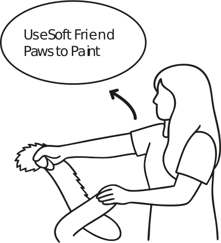
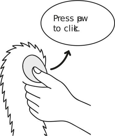
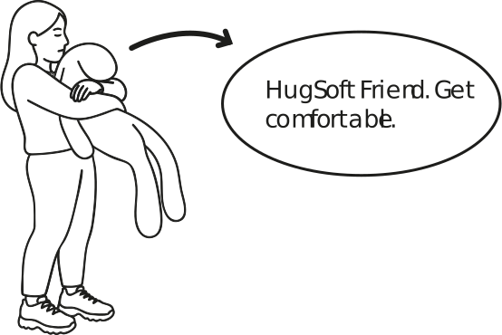
Living the Interface nutzte hängende textile Bubbles für kollaboratives Zeichnen und übersetzte Drücken, Ziehen und Greifen in gemeinsame digitale Spuren.
EmbodyVerse erforschte eine tragbare, handschuhbasierte Form körperlicher Interaktion und behandelte das Interface als Erweiterung von Bewegung und Haltung.
Weaving Information übersetzte Information in eine textile Oberfläche, die nicht primär gelesen oder geklickt, sondern durch Berührung erkundet wird.
Ausstellung als Methode
Die Prototypen wurden zunächst in einem domestic-style Ausstellungsszenario und später bei Ars Electronica gezeigt. Die öffentliche Interaktion wurde selbst zum Forschungsteil: Neugier, Zögern, Fürsorge und Irritation machten sichtbar, wie stark bestehende Interface-Erwartungen unser Verhalten prägen.
Offizielle Ars-Electronica-Projektseite
Erkenntnisse
Die Ausstellung zeigte, dass Weichheit sofort emotionale Bindung erzeugen kann, aber nicht automatisch selbsterklärend ist. Viele Besucherinnen und Besucher wollten die Objekte berühren, umarmen und länger bei ihnen bleiben, doch einzelne Funktionen mussten zunächst vermittelt werden. Gerade diese Spannung zwischen affektiver Anziehung und Lesbarkeit wurde zu einem zentralen Ergebnis.
Ergebnis
Soft Interfaces versteht Mensch-Computer-Interaktion als emotionale, verkörperte und relationale Gestaltungsfrage. Das Projekt zeigt, dass zukünftige Interfaces nicht nur benutzbar, sondern auch tröstlich, kollektiv und sinnlich reich sein können.
Memory Spaces
Memory Spaces
Eine immersive Klanginstallation übersetzt persönliche Erinnerungen mit NLP und generativer KI in räumliche Atmosphären.
Memory Spaces ist eine interaktive Installation, die im Masterstudiengang Design & Computation entwickelt wurde. Das Projekt übersetzt autobiografische Erinnerungen mithilfe eines psychologisch inspirierten Fragebogens, Natural Language Processing und generativer KI in immersive Klanglandschaften.
Anstatt Erinnerungen wörtlich zu illustrieren, verwandelt das System emotionale, visuelle und akustische Hinweise in räumliche Hörszenen innerhalb einer begehbaren Bubble-Struktur. So entsteht ein geschütztes und zugleich teilbares Hörerlebnis zwischen privater Erinnerung und kollektiver Atmosphäre.
- [ Rolle ]
- Konzept, Forschung, Spatial & Interaction Design
- [ Kontext ]
- M.A. Design & Computation, UdK Berlin x TU Berlin
- [ Zeitraum ]
- Studioprojekt, 2024
- [ Tools ]
- NLP, generative KI, Spatial Audio
Überblick
Memory Spaces ist eine interaktive Installation von Pierre Suckrow, Franz Hagen und Alessandro Mac-Nelly, die als Ausstellungsprototyp im Masterstudiengang Design & Computation entstanden ist.
Die Frage
Das Projekt geht von der Annahme aus, dass Erinnerung keine lineare Geschichte ist. Persönliche Erinnerungen sind fragmentiert, emotional und sinnlich, geprägt von Geräuschen, Stimmungen, Bewegungen und Bildern. Die gestalterische Herausforderung bestand darin, diese Komplexität in ein gemeinsames akustisches Erlebnis zu übersetzen, ohne ihre Intimität zu verlieren.
Fragebogen
Die Teilnehmenden beginnen mit einem strukturierten Fragebogen. Die Prompts führen von einer Lebensphase zu einem konkreten Moment und weiter zu Emotionen, Geräuschen, Farben und visuellen Details. So wird autobiografische Erinnerung in sinnliches, strukturiertes Ausgangsmaterial übersetzt und nicht nur in Erzähltext.
KI- & Sound-Pipeline
Die Antworten werden mithilfe von NLP und generativer KI interpretiert. Das System zielt nicht auf eine wörtliche Illustration, sondern auf eine atmosphärische Übersetzung: Handlungen, Orte und Emotionen werden zu akustischen Motiven, Ebenen und räumlichen Hinweisen.
Raum als Interface
Die Klanglandschaft wird in mehreren miteinander verbundenen, aufblasbaren Bubbles erlebt. Die Installation schirmt von der Außenwelt ab und erlaubt gleichzeitig ein kollektives Format mit individuellen und geteilten Erinnerungszonen.
Erfahrung
Die Erfahrung folgt einer klaren Sequenz: erinnern, beschreiben, generieren, eintreten, zuhören und reflektieren. So wird das Interface zu einem kleinen Ritual und die technologische Übersetzung wird spürbar, ohne die Technik selbst in den Vordergrund zu stellen.
Ergebnis
Der erste Prototyp wurde in der Ausstellung des Wintersemesters 2023/2024 gezeigt und ermöglichte bis zu zehn Personen, unterschiedliche Erinnerungszonen gleichzeitig zu erleben. Das Projekt machte sichtbar, dass Erinnerung ebenso stark von Atmosphäre und Raum geprägt wird wie von Narration.
Power of Sound
Power of Sound
Ein audiovisuelles Instrument macht musikalische Harmonie durch Farbe, Licht und Bewegung erfahrbar.
Power of Sound ist ein forschungsbasiertes audiovisuelles Instrument, das im Rahmen meiner Bachelorarbeit entstanden ist. Anstatt Harmonie zuerst über Notenschrift zu erklären, übersetzt das Projekt Tonhöhe, tonale Beziehungen und Intensität in Farbe, Licht und Bewegung.
Ausgehend von Recherchen zu Synästhesie und getestet mit Kindern verbindet das System TouchDesigner, MIDI und OSC zu einer spielerischen Oberfläche, die Musiktheorie intuitiver, räumlicher und emotional zugänglich macht.
- [ Rolle ]
- Forschung, Interaction & Sound Design
- [ Kontext ]
- Bachelorarbeit
- [ Zeitraum ]
- 2023
- [ Tools ]
- TouchDesigner, MIDI, OSC
Rahmung
Power of Sound ist ein experimentelles Lern- und Performancesystem, das 2023 im Rahmen meiner Bachelorarbeit entstanden ist. Das Projekt will Notenschrift nicht ersetzen. Es fragt vielmehr, wie Harmonie schon vorher greifbar werden kann, bevor Regeln und Theorie abschreckend wirken.
Forschungsfrage
Wie lassen sich Tonhöhe, Harmonie und tonale Beziehungen über Wahrnehmung statt nur über Erklärung verstehen? Mich interessierte eine Schnittstelle, in der Hören, Sehen und Spielen gleichzeitig stattfinden.
Recherchebasis
Die Arbeit stützt sich auf die Geschichte der Farborgeln, visuelle Musik und Synästhesie, mit Referenzen von Newton und Castel bis zu Skrjabin. Entscheidend war für mich, dass diese Traditionen nicht nur ästhetische Experimente sind, sondern Modelle dafür, wie Klang in eine visuelle Logik übersetzt werden kann.
Pädagogischer Ansatz
Ein zentraler Ausgangspunkt war Zugänglichkeit für Kinder. In der Recherche formuliere ich das Problem sehr klar: Viele Kinder verlieren die Freude an Musik, wenn sie zu früh mit Theorie konfrontiert werden. Power of Sound schlägt deshalb einen sanfteren Einstieg vor, bei dem Beziehungen über Farbe, Licht und Interaktion entdeckt werden.
Übersetzungssystem
Die visuelle Logik basiert auf einem Ton-Farb-Mapping, das sich an Skrjabin orientiert. Noten erhalten Farben, Oktavwechsel verändern Transparenz und Helligkeit, und Intensität beeinflusst das Verhalten des Bildes. Harmonie erscheint dadurch nicht als starres Schema, sondern als Atmosphäre, Mischung und Bewegung im Raum.
Prototyp
Der Prototyp mit dem Namen Marble Vision wurde in TouchDesigner entwickelt und über MIDI, Python und OSC mit musikalischen Eingaben verbunden. Ich habe sowohl eine keyboard-basierte Version als auch eine vereinfachte iPad/OSC-Oberfläche gebaut, damit das System den Studiokontext verlassen und zugänglicher werden kann.
Erprobung
Das User Testing mit Kindern zwischen etwa fünf und sechs Jahren wurde zu einem der stärksten Teile des Projekts. Die Kinder erkannten wiederkehrende Beziehungen zwischen Ton und Farbe sehr schnell, beschrieben die Bilder in eigenen Metaphern und spielten deutlich länger als geplant. Genau das zeigte mir, dass die Oberfläche nicht nur verständlich, sondern wirklich einladend ist.
Anwendungsspektrum
Entstanden ist mehr als eine Installation. Das Projekt ist visuelles Instrument, pädagogisches Experiment und grafische Sprache zugleich und lässt sich in Poster, Albumcover, Streaming-Visuals und räumliche Anwendungen weiterdenken.
Ergebnis
Power of Sound übersetzt Musiktheorie in eine erfahrbare, körperliche Situation. Harmonie wird nicht zuerst erklärt, sondern gesehen, gespürt und spielerisch erkundet.
Gap Lab
Gap Lab
Ein Service-Konzept macht den Gender Data Gap in der Herzmedizin als konkrete und fürsorgliche Patientenerfahrung sichtbar.
Gap Lab ist ein Service-Design-Konzept, das sich mit dem Gender Data Gap in der Medizin beschäftigt. Mit dem Fokus auf Herz-Kreislauf-Versorgung untersucht das Projekt, was passiert, wenn der männliche Körper weiterhin als medizinischer Standard gilt und wie Gestaltung diese oft unsichtbaren Ungleichheiten sichtbar und greifbar machen kann.
Das Konzept verbindet eine Gesundheits-App mit Medikamentenverpackung und profilbasierter Begleitung. Durch das Scannen von Medikamenten erhalten Patientinnen und Patienten verständlichere Einnahmehinweise, Warnungen vor Wechselwirkungen und auf ihre individuelle Situation abgestimmte Informationen. So wird abstrakte Datenverzerrung in eine nachvollziehbarere und unterstützendere Versorgungserfahrung übersetzt.
- [ Rolle ]
- Forschung, Service & UX/UI Design
- [ Kontext ]
- Bachelorarbeit, Hochschule Anhalt
- [ Zeitraum ]
- 2022
- [ Methoden ]
- Interviews, Patient Journey, Prototyping
Projekt
Gap Lab ist ein Service-Design-Konzept, das sich mit dem Gender Data Gap in der Medizin beschäftigt. Es übersetzt die Recherche zum Gender Data Gap in ein Service-Konzept für verständlichere, personalisierte und vertrauenswürdige Medikamentenbegleitung.
Problem
Wenn medizinische Forschung den männlichen Körper als Standard setzt, werden Diagnose, Dosierung und Nachsorge ungleich verteilt. Frauen sind in Studien noch immer unterrepräsentiert, besonders in der Herzmedizin, wo Symptome anders auftreten können und Risiken oft zu spät erkannt werden.
Recherche
Das Projekt verbindet Literaturrecherche, Umfragen, Interviews mit Betroffenen und medizinische Perspektiven. Eine Patient Journey rund um Caros Herzinfarkt machte sichtbar, an welchen Stellen Menschen nach der Diagnose nicht nur Behandlung, sondern auch Aufklärung, emotionale Unterstützung und Orientierung im Alltag brauchen.
Konzept
Gap Lab schlägt ein Connected-Care-System vor, das eine App mit Medikamentenverpackung verbindet. Durch das Scannen von Medikamenten entstehen verständlichere Einnahmehinweise, Warnungen vor Konflikten, Symptomorientierung und profilbasierte Informationen, die sich an individuelle Bedürfnisse anpassen können.
Gestaltungsprinzipien
Die Oberfläche wurde aus vier Qualitäten heraus entwickelt, die aus der Recherche hervorgingen: verständlich, freundlich, vertrauenswürdig und emotional unterstützend. Statt allein auf medizinische Autorität zu setzen, versucht das Design eine ruhigere Beziehung zwischen Patient, Daten und Alltagsroutine herzustellen.
Warum das wichtig ist
Das Projekt behauptet nicht, strukturelle Ungleichheit in der Medizin allein lösen zu können. Sein Beitrag liegt darin, systemische Verzerrung auf der Ebene alltäglicher Versorgung sichtbar zu machen und zu zeigen, wie Service Design die Lücke zwischen Diagnose, Medikation und gelebter Erfahrung überbrücken kann.
Ergebnis
Gap Lab übersetzt ein verborgenes Datenproblem in ein konkretes patientennahes System. Damit versteht das Projekt personalisierte Medizin nicht nur als technische Zukunft, sondern als gegenwärtige Kommunikations- und Fürsorgeaufgabe.
Input
Input
Eine App verwandelt Dateneingabe in gemeinsames Kunstschaffen und macht unsichtbare digitale Spuren verständlicher.
Während meines Erasmus-Aufenthalts in Irland arbeitete ich mit dem Fjord-Team zusammen, um Menschen dabei zu helfen, ihre Beziehung zu Daten besser zu verstehen. Die meisten Menschen haben kaum eine Vorstellung davon, wie ihre Daten verarbeitet werden, wo sie zirkulieren oder wie digitale Services ihr Verhalten mitformen.
INPUT ist ein App-Konzept, das diese verborgenen Interaktionen sichtbarer macht, indem aktive Dateneingabe in einen gemeinsamen kreativen Prozess übersetzt wird. Anstatt Daten als unsichtbares Nebenprodukt zu behandeln, lädt die App Nutzerinnen und Nutzer dazu ein, Prompts zu beantworten, ein persönliches Datenprofil aufzubauen und durch ihre Beiträge gemeinsam Kunstwerke zu erzeugen.
Das Video findest du hier.
- [ Rolle ]
- UX/UI & Service Design
- [ Kontext ]
- Fjord Dublin / Erasmus
- [ Zeitraum ]
- Teamprojekt, 2022
- [ Methoden ]
- UX Research, App Design, Prototyping
Kontext
INPUT entstand während meines Erasmus-Aufenthalts in Irland in Zusammenarbeit mit Fjord / The Dock. Ausgangspunkt war die Beobachtung, dass Menschen ständig von Datenextraktion umgeben sind, aber nur sehr wenig darüber wissen, wie diese Interaktionen tatsächlich funktionieren.
Problem
Die Recherche zeigte drei miteinander verbundene Probleme: verborgene Dateninteraktionen, fehlende Transparenz und sehr wenig öffentliche Aufklärung über Datensysteme. Statt Daten nur über abstrakte Datenschutzsprache zu erklären, fragte das Projekt, wie Interaktionsdesign diese Strukturen im Alltag erfahrbar machen kann.
Konzept
INPUT schlägt ein alternatives Modell vor, in dem Nutzerinnen und Nutzer Daten aktiv über Fragen, Prompts und Profileingaben beisteuern. Diese Beiträge werden nicht nur im Hintergrund gesammelt, sondern in sichtbare visuelle Ergebnisse und kollaborative Kunstwerke übersetzt, die Beteiligung nachvollziehbar machen.
Nutzungserlebnis
Die App verbindet Prompt-Feed, Profilerstellung, gespeicherte Antworten, verknüpfte Kunstwerke und eine persönliche Datenansicht. So entsteht ein Kreislauf, in dem Menschen sehen können, was sie geteilt haben, wie es mit anderen verbunden ist und wie Daten dargestellt, gespeichert und auch wieder zurückgenommen werden könnten.
Gestaltungsziel
Das Projekt versteht Transparenz als erfahrbare Gestaltungsfrage. Anstatt Nutzerinnen und Nutzer erst nach der Datensammlung zu informieren, macht INPUT den Moment des Beitragens selbst sichtbar, reflektierbar und sozial.
Ergebnis
INPUT übersetzt Data Literacy in eine konkrete Interaktion. Das Projekt zeigt, wie UX-Design Menschen helfen kann, ein Bewusstsein für ihre digitalen Spuren aufzubauen, indem Beteiligung sichtbar, ästhetisch ansprechend und hinterfragbar wird.
Kerbside Dublin
Kerbside Dublin
Ein Civic-Service-Konzept denkt Dublins knappen Bordsteinraum als dynamische und gemeinsam verhandelbare Infrastruktur neu.
Kerbside Dublin ist ein Civic-Service-Design-Konzept, das ich während meines Erasmus-Aufenthalts in Irland gemeinsam mit Dublin City Council entwickelt habe. Ausgangspunkt war ein wachsender Konflikt: Fußgängerinnen und Fußgänger, Services, Lieferungen und temporäre Nutzungen konkurrieren alle um den sehr begrenzten Raum an Gehwegen und Bordsteinkanten.
Anstatt sich auf statische Meldesysteme zu verlassen, entwirft das Projekt eine mobile Plattform, mit der Bewohnerinnen und Bewohner Probleme direkt vor Ort dokumentieren, nahegelegene Hinweise verknüpfen und einzelne Beschwerden in gemeinsames lokales Handeln übersetzen können. Der Bordstein erscheint hier nicht als starre Infrastruktur, sondern als dynamische urbane Schnittstelle, die ausgehandelt, priorisiert und gemeinsam verbessert werden kann.
- [ Rolle ]
- Service Design & UX/UI Design
- [ Auftraggeber ]
- Dublin City Council / Smart Dublin
- [ Zeitraum ]
- 2 Monate, 2022
- [ Programm ]
- Adobe XD
Auftrag
Kerbside Dublin entstand in Zusammenarbeit mit Dublin City Council / Smart Dublin und untersucht, wie Bordsteinkanten in einem dichten und sich ständig verändernden Stadtraum dynamischer organisiert werden können.
Problem
Gehwege und Bordsteine sind umkämpfte Zonen. Fußgängerinnen und Fußgänger, Müllabfuhr, Fahrräder, Ladezonen, temporäre Hindernisse und städtische Services überlagern sich täglich, während bestehende Werkzeuge oft nur einzelne Beschwerden erfassen, statt ein größeres lokales Muster sichtbar zu machen.
Konzept
Der Entwurf denkt eine Civic-App, die Menschen dabei unterstützt, Probleme direkt vor Ort zu melden, Fotos hinzuzufügen, Dringlichkeiten zu beschreiben, benachbarte Fälle zu sehen und zu verstehen, ob ein Problem Teil einer wiederkehrenden Situation im Quartier ist.
Problem melden
Der erste Interaktionsablauf konzentriert sich darauf, Probleme sichtbar zu machen. Nutzerinnen und Nutzer können am jeweiligen Ort einen Fall anlegen, die Situation dokumentieren, die Art des Konflikts einordnen und seine Dringlichkeit priorisieren.
Gemeinsam verfolgen und handeln
Der zweite Teil des Konzepts verschiebt den Fokus von der Meldung zur Koordination. Area-Dashboards, Updates, Diskussionsräume und Handlungsimpulse helfen dabei, einzelne Beobachtungen in kollektive nachbarschaftliche Reaktionen zu übersetzen.
Gestaltungsintention
Das Projekt fragt, wie Menschen urbane Reibungen selbst in die Hand nehmen können, statt nur passive Beschwerdeführende zu bleiben.
"Eine App, die es Ihnen ermöglicht, die Probleme in Ihrer Stadt selbst in die Hand zu nehmen."
Damit versteht Kerbside Dublin bürgerschaftliche Beteiligung als Interface-Frage: Wie kann Melden verständlich, lokal verankert und handlungsfähig werden?
Ergebnis
Kerbside Dublin übersetzt ein kommunales Systemproblem in ein öffentlich zugängliches Service-Modell. Das Projekt zeigt, wie Service Design komplexe Konflikte im Straßenraum lesbarer, kollaborativer und reaktionsfähiger machen kann.
Power of Machine Learning
Power of Machine Learning
Ein parametrisches audiovisuelles System untersucht, wie KI Autorenschaft und kreative Kontrolle verschiebt.
In Power of Machine Learning habe ich untersucht, wie künstliche Intelligenz die Rolle von Designerinnen und Designern verändern könnte. Im Mittelpunkt stand die Frage, was passiert, wenn KI nicht mehr nur als Werkzeug dient, sondern zunehmend eigene formale Entscheidungen innerhalb kreativer Prozesse trifft.
Dafür habe ich mich intensiv in TouchDesigner eingearbeitet und ein audiovisuelles Video entwickelt, dessen Visualisierungen vollständig parametrisch und codebasiert erzeugt wurden. Ergänzt wird die digitale Bildsprache durch einen selbst produzierten Soundtrack aus analogen Synthesizern. Das Projekt thematisiert die Spannung zwischen technologischer Autonomie und kreativer Kontrolle und stellt die These auf, dass Designerinnen und Designer durch KI zwar neue Möglichkeiten gewinnen, gleichzeitig aber an gestalterischer Freiheit verlieren könnten.
- [ Rolle ]
- Creative Coding, Motion & Sound Design
- [ Kontext ]
- Experimentelles audiovisuelles Projekt
- [ Zeitraum ]
- 2024
- [ Tools ]
- TouchDesigner, analoge Synthesizer
Ausgangspunkt
Power of Machine Learning untersucht eine Verschiebung von Autorenschaft. Das Projekt fragt, was sich verändert, wenn künstliche Intelligenz nicht mehr nur wie ein passives Designwerkzeug funktioniert, sondern Bild, Rhythmus und Variation eigenständig mitformt.
Aufbau des visuellen Systems
Um diese Frage gestalterisch zu bearbeiten, habe ich mir TouchDesigner angeeignet und ein audiovisuelles System entwickelt, dessen Bildwelt vollständig über Parameter, Regeln und Code erzeugt wird. Statt einzelne statische Frames manuell zu komponieren, entstand eine visuelle Logik, die eigene Zustände erzeugen, verändern und weiterentwickeln kann.
Sound als Gegenpol
Die digitale Bildsprache wird von einem Soundtrack begleitet, den ich mit analogen Synthesizern produziert habe. Gerade dieser Kontrast wurde zentral: prozedurale Bildgenerierung auf der einen Seite, taktile und körperliche Klangproduktion auf der anderen.
Kontrolle und Delegation
Das Projekt interessiert sich weniger für KI-Euphorie als für ihre Konsequenzen. Wenn das System beginnt, Form und Ästhetik selbst vorzuschlagen, verschiebt sich die Rolle der Designerinnen und Designer von der aktiven Gestaltung hin zu Kuratierung, Auswahl und Kontrolle. Genau diese Spannung bildet den konzeptuellen Kern der Arbeit.
Ergebnis
Power of Machine Learning ist zugleich audiovisuelles Artefakt und gestalterisches Argument. Das Projekt zeigt, dass KI kreative Praxis erweitern kann, dabei aber auch Autorenschaft, Intuition und formale Freiheit neu zur Verhandlung stellt.
Oasis at the Corner
Oasis at the Corner
Ein modulares Sitz- und Schutzsystem verbindet Aufenthalt, Lesen und Begrünung im öffentlichen Raum.
In diesem Projekt entwickelte ich ein modulares Sitzsystem, das zugleich Schutz bietet und ein integriertes Regal für Bücher und Pflanzen enthält. Der Entwurf schafft einen offenen Ort, der den Stadtraum belebt und Menschen Raum zum Ausruhen und Lesen gibt.
Das System ist bewusst flexibel angelegt: Die Menschen entscheiden selbst, wie sie es nutzen und miteinander kombinieren. Als farbiger, zugänglicher Treffpunkt kann es den öffentlichen Raum verändern und Gespräche anstoßen.
Das Video ist hier zu sehen.
- [ Rolle ]
- Produkt- & Raumdesign
- [ Kontext ]
- Konzept für den öffentlichen Raum
- [ Zeitraum ]
- 2021
- [ Methoden ]
- Konzept, Modellbau, Visualisierung
Idee
Oasis at the Corner denkt Stadtmöbel als kleine urbane Intervention neu und verbindet Schutz, Begegnung, Begrünung und Lesen in einem modularen Objekt.
Gestalterischer Fokus
Das System wurde auf Offenheit und Flexibilität ausgerichtet. Menschen können sich die Struktur auf unterschiedliche Weise aneignen, sodass sie auf wechselnde Bedürfnisse im öffentlichen Raum reagieren kann.
Urbane Relevanz
Das Projekt reagiert auf den Mangel an einladenden, farbigen und menschenzentrierten Orten in der Stadt und schlägt eine sozialere und zugänglichere Atmosphäre vor.
BETTERPLACE
BETTERPLACE
Eine kanalübergreifende Awareness-Kampagne übersetzt Betterplaces Mission in fokussierte und umsetzbare Kommunikation.
Room117 wurde gegründet, um für Betterplace eine wirkungsvolle Awareness-Kampagne zu entwickeln. Ziel war es, die Organisation stärker sichtbar zu machen und mehr Menschen auf ihre Website zu führen.
Wir erarbeiteten kosteneffiziente Kommunikationsansätze, die sich über mehrere Kanäle ausspielen lassen. Der Auftraggeber entschied sich für eines der vorgeschlagenen Konzepte, das anschließend gemeinsam umgesetzt wurde.
Die erfolgreiche Umsetzung zeigte, wie wir als Agentur strategisches Denken, Gestaltung und kanalübergreifende Kommunikation zu einer wirksamen Kampagne verbinden können.
- [ Rolle ]
- Kampagnen- & Kommunikationsdesign
- [ Auftraggeber ]
- Betterplace / Room117
- [ Zeitraum ]
- 2019
- [ Methoden ]
- Strategie, Kampagnenkonzept, Visual Design
Zusammenarbeit
Das Projekt entstand im Team mit einem starken Fokus auf strategische Kommunikation, Konzeptentwicklung und Kampagnendenken.
Herausforderung
Gesucht war eine Awareness-Kampagne, die kosteneffizient und kanalübergreifend einsetzbar ist und Betterplace zugleich sichtbarer und relevanter macht.
Ergebnis
Das ausgewählte Konzept zeigt, wie ein designgetriebener Ansatz Werte in klare Kommunikationsformate mit öffentlicher Wirkung übersetzen kann.